Typography / Task 1: Exercises

25/08/2020 - 28/08/2020 (Week 1 - Week 5)
Fann Man Ling - 0344623 (BDCM)Lectures & Exercises
LECTURES
Week 1: Introduction and Briefing (25/08/2020)
For the beginning of the class, Mr. Vinod gave us a briefing regarding the module information, which concludes the course purpose, rubric, assessments throughout the semester, rules that we should know on doing assignment, namely the terms of plagiarism and resubmit assignment is allowed after done the submission before. He also introduced us about the platform that we used to carry out the class, mainly Facebook group, as well as the applications that we will be going to use.
Moreover, Mr. Vinod guided us on how to start a blog by using the correct format for our E-portfolio. After that, we were given our first task called Type Expression, which is to choose any 4 words that have posted on our Facebook group and then digitalize it by using Adobe Illustrator. I think the purpose of this task is to allow us to learn how to transfer our manual sketches into digital device. After all, we will be going to use a lot of digital platforms to create and perform our design works in the future of this digital era.
For the practical session, Mr. Shamsul took over and taught us some tools and menus in Adobe Illustrator and some keyboard shortcuts.
- Setting up a blog
- Know the Shortcut key in Illustration
- Have the picture of what does Typography look like.
Week 2: Typographt Developmant & Timeline (01/09/2020)
(1) Development / Timeline
The lecture and slides was presented to us via Youtube video, which focuses on the development of Typography. Not to mention, all the information that presented in the slides is written from the perspective of the Western world.
- Internet information
1. Early Letterform Development (Phoenician to Roman)
a) Initial witing- Scratching into wet clay with sharpened stick / craving into stone with a chisel.
b) For nearly 200 years, uppercase is the only letterform.
*Uppercase: simple combination of straight line and circles (due to the crude writing tool)

Fig 1.1: Letterform development (Source: Google) (1/9/2020)
[1.] Greeks
- Developed a style of writing (Boustrophedon)
- Change the writing directions
= Change the direction of reading (from right-left-right alternatively)
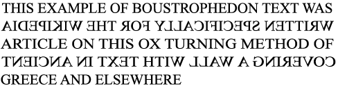
Fig1.2 : Boustrophedon Text (Source: Google) (1/9/2020)
- Both Greeks and Phoenician didn't use letter space and punctuation.
[2.] Etruscan (and then Roman)
- took repaint brush, drew out on marbles (before inscribe them).
* B.C.E = before 0 year

Fig 2: Timeline of Phoneician to Roman (Source: Lecturer slide)
2. Hand Script
[1.] Roman
(a) Square Capitals
- Serifs added to the finish of the main stroke. *Serif: A short decorative line
(b) Rustic Capitals
- more compressed capital (for pragmatic reason)
👍: took less time to write (30 angle)
👍: allowed for twice as many words on a sheet of parchment
👎: harder to read (due to their compressed nature)
(c) Lowercase letterform (Cursive hand)
- both Square and Rustric capitals is used to record documents.
- But, everyday transactions is written in cursive hand (forms were simplified)👉 lowercase letterform started to be developed.
- incoporate some aspects of Roman cursive hand (A,D,E,H,M,U,Q)
- have no uppercase and lowercase letterforms.
(e) Half-Unicals
- formal beginning of lowercase letterforms
- replete with assenders (h,d,b) and decender (y,g)
[2.] Charlemagne (the first unifier of Europe since Romans)
- set the dtandard of Calligraphy
- edict in 789 standardize all ecclesiastical text.
- the monk rewrite the text using:
- majuscules & miniscule (upper &lowercase)
- capitalization
- punctuation
[3.] Blackletter to Gutenberg's type (After dissolution of Charlemagne's empire)

(a) Blackletter / Textura
(b) Rotunda
(c) Gutenberg's type
[4.] Humanist Script to Roman Type (1460- 1472)
[5.] Venetian Type (1500)
[6.] The Golden Age of French Printing
[7.] Dutch Printing (1600)
[8.] English Type (18th Century) (1734)
[9.] Baskerville's Innovations (1761-1818)
[10,]19th Century Types
[11.] First Square Serifs
[12.] Early 20th Century Sans Serif (1923-1959)
Text Type Classification
- Blackletter (1450)
- Oldstyle (1475)
- Italic (1500)
- Script (1550)
- Transitional (1750)
- Modern (1775)
- Square Serif / Slab Serif (1825)
- Sans Serif (1900) [*Sans: without]
- Serif / Sans Serif (1990)


1. Have a basic understanding for the history of Typography.
Week 3: Basic / Describing Letterforms (08/09/2020)
1. Letterform:
- Knowing a letterform's component parts make it much easier to identify typefaces.
* Lexicon = Terminology
2. Imaginary Parallel Line:
(a) Baseline
- The imaginary line the visual base of the letterforms.
(b) Median
- the imaginary line defining the X-height of letterforms.
(c) X-height
The height in any typeface of the lowercase 'x'


- Stroke (line)
- Apex (above) / Vertex (below) (point)
- Arm (short strokes off the stem)
- Ascender
- Barb
- Beak
- Bowl
- Bracket
- Cross Bar
- Cross Stroke
- Crotch
- Ear
- Em / En
- Finial
- Ligature
- Link
- Loop
- Serif
- Shoulder
- Spine
- Spur
- Stem
- Stress
- Swash
- Tail
- Terminal
4. Uppercase , Lowercase
- Small Capitals (draw to the X-height of the typeface)
5. Numerals :
- Uppercase Numerals (lining figures)
- Lowercase Numerals (old style figures / text figures)
6. Italic vs Roman
- Roman (uppercase forms are derived from inscriptions of Roman monuments)
- Italic (Named for fifteenth century italian handwriting on which the forms are based)

8. Ornaments (Used as a flourishes in invitations or certificates)

9. Typeface
- Roman
- Italic
- Oblique (Roman form of the typefame)
- Boldface (thicker stroke than Roman)
- Light (thin)
- Condense (compressed)
- Extended (Extended variation of the Roman)


As a beginning typography, should study these 10 faces carefully for the projects in design programme, for better understanding and appreciating other typefaces as encounter them, once understood how to use them effectively.
Week 4: Text (Part 1) (15/09/2020)
TEXT
1. Tracking: Kerning and Letterspacing
(a) Kerning : Automatic adjustmet of space between letters.
(b) Letterspacing : Add space between the letters
(c) Tracking : Addition and removal of space in a word / sentence.
(d) Counterform : The spacing between letters

2. Illustrator vs InDesign
Illustrator → Graphical creations (logo, etc.)
InDesign → Deal with large amount of text (brochures, books, etc.)
SHORTCUT KEY (InDesign)
- Ctrl + Shift + >/< : Increase size of the word
- Ctrl + ; : Make margin disappear.
- Ctrl + A : Select all
- Alt + →/← : Increase / Reduce the amount of space between the word
When to use Kern / Letterspace?
Designers always letterspace uppercase letters:
Uppercase letterforms are dawn to be ab le to stand on their own;
Lowercase letterforms require the counterform created between letters to maintain the line of reading


3. Text Formatting
(a) Flush Left
-This format most closely mirrors the assymetrical experience of writing.
- Each line starts at the same point : Ends wherever the last word on the line ends.
- Spaces between words are consistent throughout the text. (allowing the type to create an even grey value)
[Ragged right]
(b) Centered
- Imposes symmetry upon the text (assigning equal value and weight to both end of line)
* this should used sparingly for small amounts of copy or text.
[Ragged left & right]
(c)Flush Right
- Places emphasis on the end of a line as opposed to its start.
- Useful in situatuibs (like captions) where the relationshio between text and image might be ambiguous without a strong orientation to the right.
[Ragged left]
(d) Justify
- Like centering, this format imposes a symmetrical shape on text.
- Achieved bt expanding / reducing spaces between words or letters.
- The resulting openness of lines can occasionally produces 'rivers' (gaps) of white space running vertically through the text.
* Not encouraged for designer to use:
- Clear, appropriate presentation of the author;s message. (easy to read)
- Uppercase letters is not suitable to be used in Italic styled typefaces
3. Texture
- Different textures of typefaces should be considered.
- A type with a great X-height and heavy stroke width produces a darker mass on the page, so sensitivity to these differences in colour is important in creating successful layouts.

- Ascender : The space above the X-height
- Descender : The space below the X-height
4. Leading & Line Length
- the goal of setting text type is to allow for easy, prolonged reading.
- a field of type should also occupy the page as much as the paragraph does.
(a) Type size
- Large enough to be read easily at arm length (imagine you holding a book in your lap)
(b) Leading
- Text (set too tightly) encourages vertical eye movement (reader easily loose his place) ; Text (set too loosely) creates striped patterns (distract reader from the material at hand)
* Leading: The space between each line of text
* more leading : lighter ; less reading : darker


(c) Line length
- Shorter line requires less reading ; Longer line requires more reading.
- A good rule of the thumb keep line length between 55-65 characters. (not too short/ long)
5. Type Specimen Book
- Shows samples of typefaces in various different sizes
- Provides an accurate an accurate reference for type, type size, type leading, type line length,etc.

Compositional requirement :
- Text should create a field that can occupy a page or a screen.
- An ideal text has a middle grey value, not a series of stripes.
Week 5: Text (Part 2) (22/09/2020)
1. Indicating Paragraphs (ways of indicate paragraph spacing:)
(a)Pilcrow ¶ : used to indicate paragraph space
(b) Line space vs Leading
- Line Space space between 2 sentences, from the descender of one sentence to decender of another sentence.
- Leading takes to consideration the descender of one sentence to the ascender of another state should be 2.5-3 larger than the type point
(c) Create indentation
- indent : the same size of the line spacing = same point size used for text.
* Best used when text is justified because ragging on the right is bad.
2. Widows & Orphans
- Widows : short line of type left alone at the end of a column of text.
- Orphans : short line of type left alone at the start of new column.
- Solutions for Widows:
- use forced line break (Shift + Enter)
- use Alt + left/right arrow key (not more than 3)
- adjust (Edit-Preferences-Tracking) to 5

3. Highlighting Text (large amount of text)
- different kinds of emphasis require different kinds of contrast.
- Bold
- Italic
- Colour the text (Cyan, Magenta, Black)
- Change typeface
- Sometimes it is necessary to place certain typographic elements outside the left margin of a column of type
- Prime″ is not a quotation marks“”.


5. Cross Alignment

Week 6: Understanding (29/09/2020)
1. Understanding letterforms
- Uppercase letter forms below suggest symmetry, but it's not symmetrical.
- Some nuances on strokes/serifs are made to create iotical illusion and make them seem visually equal weight.
- Subtle differnces made a huge impact in readability and the appearance of a letter form.

When designing own font, keep in mind:
- Making too many changes to the letter will create an over decorative font.
- The font needs to be simpliflied characteristics within the strokes of the letters, and consistent and replicable. (Less is More)
- Analyse an existing typeface, examine the treatment of a particular letter ('s' & 'g') in different typefaces
2. Letters
- the complexity of each individual letterform is neatly demonstrated by examing the lowercase 'a' of 2 seemingly similar sans-serif typefaces (Helvetica & Univers)

3. Maintaining X-height
- Curved stroke such as 's' MUST rise above the median & sink below the baseline in order to appear to be the same size as the vertical & horizontal strokes that adjoin,
- Letters such as 'o' & 's' look smaller because they have lesser real estate touching the median and baseline. To compensate for that, optical adjustment has to be done.


4. Letter - Form - Counterform
- Counterform: the blank spaces between individual letters optimized to create equal spacing between letters

- To understand the form & counter of a leter is to examine them in close detail.
- The examinations provide:
- a good feel of how the balance between form & counter is achieved
- a palpable sense of letterform's unique characteristics
- know the process of letter-making

5. Letters - Contrast
Contrast : powerful principle to apply in Typography design.

Week 7 : Screen & Print (07/10/2020)
Typography in different medium (Print & Screen)
- Although the usage of screen is increasing in this day and age, print cannot be replaced easily by screen because touch and feel is a crucial part in decelopment and learning process.
Type for Print:
- Casion, Garamound, Baskerville
- because they are elegant, intellectual, highly readable when set to small font size.
- Legible, has neutrality and versatility that makes typesetting easy.
Type for Screen
- Verdana, Georgia (DON'T use on paper!)
- are optimized and oftern modified to enhance the readability and performance on screen.
- There's NO clear-cut rules in Typography tho, it's subject to the sensibility of the designer.
Hyperlink
- A word/ phrase/ image that can be clicked on to jump to a new document / new section within current document.
- Usually blue & underlined by default.
Font size for screens
- Text printed on books is usually set at 10pt (because we read them pretty close).
- ≧12pt, if we were read them at arm's length (= 16 pixels on screen).
- Static : has minimal characteristic in expressing words. (e.g.: Bold, Italic)

- Motion: dramatized type, fluid & kinetic, contains animated types.

INSTRUCTIONS
EXERCISE
1. Adobe Caslon Pro
2. Bembo Std
3. Bodoni Std
4. Futura Std
5. Gill Sans Std
6. ITC Garamond Std
7. ITC New Garamond Std
8. Janson Text LT Std
9. Serifa Std
10. Univers Lt Std
2. Bloom
3. Tired
4. Twirl
Then, I made some sketches for each of them in the hope of getting the best one for me afterward.


I took two days to come out all these sketches and I was having a hard time to think of those ideas at first because I've been putting less efforts on thinking and creating idea for a long time during the MCO period. I pushed myself to sit down and focus and constantly crave for idea. Eventually, those ideas started popping up in my mind, then I quickly sketched them out.
Task 2 : Digitalize the sketches (Part 1) // WEEK 2
I started to create the design on Adobe Illustrator.
1. Bang!


Final Work:

For the next task, we are intructed to make our work into GIF format. I decided to animate the word 'Tired" as I got an idea for it than others. I was planning to make the "IRED" as a pressure and tiredness that fall from above to the back of "T", in a way to make it feel exhausted that couldn't stand straight.

I learned that to duplicate the Artboard, we need to press "alt" while dragging the Artboard after pressed the "Shift" button and "O".
After done making the draft on AI, I exported it as JPEG file, then opened it on Photoshop. I encounted an issue, which is I can't find my layer of other pictures. So I went to rewatched the tutorial video posted on Youtube, found out that I should click on 'Script" from "File", and choose the "Load files into stack", then only those pictures will appear at the layer.
Then I followed all the instructions stated in the video in creating the frame timeline to make the word moving.

Finally, I got this done. This is so fun and interesting, I kind of wanted to learn more ways to do more and more fancy animations:

After received the feedback from Mr. Vinod, I redid it:
* I changed the GIF final outcome which is the letter’s 'IRED' falling on the letter “T” and it then made the ‘T’ bends.

Task 3 : Text Formatting // WEEK 5
PART 1:
For this week, our task was to format text by using Adobe InDesign. I've never heard of and used it before. So I rewatched the tutorial video several times to get a better understanding on it.


Result:

Then, Mr. Vinod asked us to copy and paste one of the name cards above Fig 1.3 and attach it into another sheet. Mr. Vinod asked us to create column and rows by using the tools from Layout options and cite our self-introduction into it. It needed to be edited of course, such as doing letterspacing and adding forced line break.

Result:

Final Work:
After received feedback from Mr. Vinod, I made changes on it:
* Redesigned the forth name card. Fig 2.3


Final PDF (Fig 2.3 & 2.4):
PART 2:
Mr. Vinod assigned us these exercises: Fig 3.1 was done in the class ; Fig 3.2 was our homework (can choose any article from KreatifBeats).


After feedback give Mr. Vinod, I redid all the things again:
* Reworked on the Ragging for both article.


Final Work:
Fig 4.3: Final Work.pdf (26/09/2020)
FEEDBACK
There's no feedback given on this week.
General Feedback:
- Mr. Vinod told us that whenever you copy paste information from a different source, you must make sure that you unformat the text first. The method to do that is select the area you pasted in the Blog, then go to the list button (more options), there's a little T which have stroke accross, select it to clear the formatting. Therefore, it will delete any formatting that given for that particular text.
- He also advised us to keep the Calligraphy as simple as possible, less graphic elements in the type design would be better.
- He reminded all of us to fill both general and specific feedback given in the Excel sheet that can be found in Facebook Group, as well as in the blog.
I was late showing my type design, sir suggested me to work on any sketch that I prefer and try to catch up with the progress in the class as soon as possible.
Mr. Vinod told us that:
- Sometimes you will find some of the ideas or animations may look similar to the ideas that you have came out with. This can be normal and it's a learning process. It's fine if you came out the ideas by yourself without inspired or influenced by others or peers although it is similar to someone else.
- However, if you find you are influenced by someone else, it is vital to tell self that try to come out own original idea.
Specific Feedback:
Mr. Vinod advised me to animate only the letter "T" whereas the letters "IRED" need no to be animated. Or other option is to make the letters "IRED" falling on the letter "T", then the "T" becomes getting tired and tired and bends.Week 4 // Demo & Instruction in-class
No feedback was given as it's demo and instruction session on this week.Week 5 // Text-Formatting
General Feedback:
Mr. Vinod advised us several things that we must pay attention in formatting text:- Don't use indentation if paragraph spacing was used.
- If indentation is used, the text need to be justified.
- Avoid using Bodoni for smaller font size because it is too contrast, as such reduce the readability.
- Paragraph spacing should be equal to leading.
- When exporting as JPEG, the dpi have to set at 150dpi.
Specific Feedback:
Mr. Vinod pointed out some issues that I should make ammends on:- Distance between paragraph spacing doesn't exist in the body. (Fig 1.3).
- Point size is abit small in the fourth name card. (Fig 1.3)
- Some of the sentences look tight while others are fine, need to be careful when you're kerning. (Fig 2.2)
- Cross alignment is not existed between Headline and Body text. (Fig 3.1)
- Ragging could be slightly better. (Fig 3.1)
- Ragging is not good. (Fig 3.2)
REFLECTION
Week 2 (01/09/2020)
Luckily there are recorded video and clear announcements that shared by my lecturer Mr. Vinod on Facebook group so that I can watch back and do my work by following the instruction step-by-step.
However, on the other hand, I find it kind of interesting about the course Typography. I thought it would be boring as I am enthusiastic about illustration, while designing text is outside my sphere of interest.
I noticed that I still have a lot of confusing about the tool provided in AI and they are not introduced in the lecture videos.
Besides, I had also a hard time to figure the design idea out when I was doing this exercise. Hopefully I can gain more ideas and inspirations through involving myself into more and more exercises, as well as my skill of using AI can be improved by leaps and bounces.
Actually, I quite impressed by myself that I am manage to come out the work by using AI from sketches. I was so discouraged that I'm gonna screwed up the exercise as my classmates all seem greater than me and they are fast too.
⤀ Note to myself: Always remember why am I here doing design, be passionate and optimistic!
Week 3 (08/09/2020)
Week 4 (15/09/2020)
Week 5 (22/09/2020)
FURTHER READING
WEEK 2
I read an article that related to Type history from Fontology.
The article explains mainly about the First Alphabets. Here's some summary of it:
- In ancient, people have always felt the need and found a way to record the details of their lives. The first messages weren't actually "writing" as we know it. Rather, they were simple tokens: a flower left outside someone’s hut symbolizing a tender sentiment, a pile of rocks along a trail warning of danger. Slowly, however, these tokens and signs evolved into marks.
- The marks were the beginning of written communication. In fact, they had to be simple and well shaped.
- The first writings were graphic images that represented something tangible. Simple shapes like man, woman, fire, food, tree, etc.
- Eventually, people needed more symbols to express more words. So they multiplied the symbols like "trees" make a "forest".
- Then, graphic forms of espression were developed to respond to their growing demands.
- Earlier symbol writing, which referred to specific things or ideas, was inadequate for expressing abstractions, and difficult for keeping records or creating documents.
- To overcome these shortcomings, new writing systems required a reduction in form, and expansion of meaning.

WEEK 3
For this week, I also read an article from Fontology. This article is mainly explains about Typeface Families.
For this week, I also read an article from Fontology. This article is mainly explains about Typeface Families.
*Type family : A range of typeface designs that are variations of one basic style of alphabet.
- Before 1700s, the notion of having a family of type hadn't occured to anyone yet.
- In the late 1700s, foundries began to release fonts in a families (pairing roman and italic design that matched each other in style).
- In the 20th century, type families were introduced different designs, such as condensed, expanded, and outlined.

- In the late 19th & 20th centuries, Director of typeface development for American Type Founders conceived the modern idea of a typeface family.

Fig 2 : American Type Founders Cheltenham
- In 1957, the Swiss type designer Adrian Frutiger designed a new kind of type family .
- In Frutiger’s system, each typeface was given a two-digit suffix.
- The first difit classifies the alphabet weight (3- lightest weight ; 9- boldest weight)
- The second digit identified the typeface proportion (higher number- condensed designs ; lower numbers- expanded design)

WEEK 4
For this week, I read an article that is regarding Type Anatomy from Fontology.
In this articles, I learned one of the basic typefaces, in which small caps.

Summary:
- Small caps : Uppercase letterforms that are shorter in height than the capitals in a given typeface.
- Small caps that are designed for display typefaces have more flexibility in their proportions, and are often taller than the x-height.

- OpenType font format (true-drawn small caps) were only available for a limited number of typefaces.
- allow for expanded character set

WEEK 5
I read an article regarding Rags, Windows and Orphans that is under Text Typography (Practical Typography) category from Fontology.

Summary:
1. Rags
- When setting type with a ragged margin, pay attention to the shape that the ragged line endings make.
- Good rag: goes in and out from line to line in small increments.
- Poor rag : created distracting shapes of white space in the margin.
* To correct poor rags: making manual line breaks, editing your copy, or slight adjustments in point size/column width.

2. Widows and Orphans
- Widow: a very short line (usually one word / the end of a hyphenated word) at the end of a paragraphh/column.
- considered poor typography because it leaves too much white space between paragraphs / at the bottom of a page.
- Orphan : a single word / part of a word / very short line appears at the beginning of a column/page.
- results in poor horizontal alignment at the top of the column/page.

*Further Reading of Week 6 & 7 are on another blog post (Project 1).


Comments
Post a Comment